Saturday, August 27, 2011

A Whimsical Baby Shower

My best friend just had a big baby shower the other day and all of us girls and her incredibly talented mother pulled some fun ideas together that I thought I would share. Some of these ideas would work great for any kind of party.

We (Kimberly Lais, Amanda Romero, Ricky Lais, Isabelle Johnson, Nicole Johnson, I) all worked together to make paper party pom poms. I attached them to the kitchen light fixture. We added some delicate butterflies and it created a whimsical and colorful glowing centerpiece.  It's incredibly inexpensive and makes a statement. You could do a lot with this idea!
 Below is the light fixture in the process of getting covered with the pom poms. If you do this, make sure your light fixture is using low energy light bulbs so that the paper doesn't catch fire.

 
Here is a tutorial on how to make these adorable paper poms. They also look fantastic hanging from different heights from the ceiling by fishing line.

The mother-to-be's mom, Isabelle, and I hung vintage baby clothes that were in the family on a clothesline with vintage clothes pins.  We also put the mother-to-be's baby shoes on a pedestal to showcase them.


Here is a cute snack idea! The popcorn bags were made by Isabelle Johnson. And they are placed in my chalkboard ice bucket.
There was a lavish and very delicious sweet feast.

 
We added Easter colored twinkle lights wrapped with tulle to add sparkle and softness.

Below are some adorable desserts that fit the theme of the event.
Desert cakepops by Isabelle Johnson.
Here is a fantastic site that has a ton of cakepop recipes.

The Mother-to-be's aunt, Janet Dodge, made these cute rubber ducky cookies.
A fantastic addition to any event is this fruit salsa I made. It works great as an appetizer or desert and is served with cinnamon pita chips.
Here is the recipe for the fruit salsa. It can be altered to have any kind of fruit in it. I also like to add a dash of cinnamon and I garnish it with a sprig of mint.

Below is the burlap print and frame I made for my dear friend.
Even the chairs in the backyard fit into the theme of the party!

Below is a fantastic centerpiece and gift idea. This is a diaper cake made by Isabelle Johnson.
Here is a great site that can teach you to make this along with baby clothes bouquets.


Pin It

Tuesday, August 16, 2011

Quick Design Tips Part 1

Hey all!! Happy Tuesday! I thought I'd share a few design tips with ya'll to really enhance the space you are working with!

1.) The least expensive way to change the look of the room is to paint...Even if its just an accent wall. The greatest part is if you don't like it, it's inexpensive to paint it back. Throw pillows are another great way to do the same thing. I have very neutral pieces of furniture but am able to completely change the look and theme of the room by changing the pillows.

My fireplace wall is chocolate brown and it makes a big impact on the room. The silver gilded frame adds a touch of elegance to the the room and, is a great contrast to my rustic and shabby pieces.

2.) Lighting and plants add dramatic impact. It is hard to have too many plants. People naturally feel better when they are around greenery, and they add a softness and great color to space. Plants also work as a great room divider.
Play with your lighting. Add lots of candles to set the mood for a dinner party, movie or date night. Also put your lights on dimmer switches. People look best in dimmer light and it creates great ambiance. It will make your guests feel like they are having a big night out.  I light candles and listen to jazz every evening while I am cooking or working. Setting the mood even if it's just for me makes my day seem special even if I am doing the most mundane of things.

Above, I used the plants to divide the kitchen and living area. The large palm in my family room creates movement for the eye and brings down the tall ceilings. The crystal wall sconces add glamour and great light to the room.

 
Here is a picture of my old home. The candles and larger chandelier add mood to the space.

4.) There is a big design myth out there that if your space is small you are supposed to put small scaled things in there to make it appear larger! Big lie! A small room needs large scaled looking things to make it appear bigger. Now, the piece could be small but, it should look bulky, not dinky.  Hang Curtains higher than the actual window. If your ceilings are much taller than the window then hang it about 8" above your window. If you have shorter ceilings, hang them an inch or two below the ceiling. This will make the room appear  taller and the window larger. The same rule goes for hanging drapes a bit outside the width of the window to make it appear wider. Unfortunately, I am unable to do this in my apartment because there are studs that completely surround the windows :(
 Large chandeliers, pictures, and drapes hung high will do the trick. Your place will look so grand if you follow this design rule.
This is my clients kitchen and it's extremely tiny. The large light fixture makes the space seem grand and the drapes hung a bit above the windows make the windows appear to be larger and the ceilings taller. Vertical Panels will give it that effect and a horizontal valence will bring the ceiling and window down.

3.) Put things in your home that make you happy and give it charm...You don't want your place to look like you ordered everything out of a catalogue and everyone in the country has the same thing. Find unique pieces at thrift shops, junk yards and yard sales and make it your own. Most things in your home should have a story to go along with it. Like I have said in the past... pull out your family treasures (NOT the old plaid recliner) and put them to good use!
This is a shelf in my room with special goodies. Everything on it has a story.

 
I just love my fruit crate night stands. they have a ton of  charm and were dirt cheap. Check out the Fruit Crate Nightstand post for more details. The headboard was built by my amazing hubby and our friend Jeff. It's made of painted moulding and fabric wrapped around foam core board. I found the headpiece for a couple bucks across the street from the Palace of Fine Arts in San Francisco at a yard sale.  It was ripped out of an old Victorian mansion.  I love it!!
 
This is the top of a desk in one of my clients homes, and is filled with family treasures.

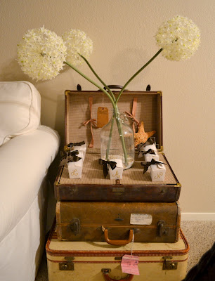
Here is my vintage stack of luggage. It stores things, works as a side table and its
holding party favors on top for a brunch I just hosted.
This is a side table at my clients and, it holds colorful toy trucks that were in the family, old school books, and a vintage mason jar filled with shells that were collected on family vacations.

5.) Having trouble picking out a color scheme? Base your room off of a picture, painting, rug or piece of fabric. Usually it will have all the colors (main and accent) pulled together for you. Another idea is to go to the paint store and they will have color combinations on swatches that already look fantastic together. It is a free and easy to carry around guide while you are shopping and looking for things for your home.  If you are picking out a bold color for your wall pick out your fabrics and rugs first!!!! It is much easier to match paint to a piece of fabric, rug or painting than it is to match all of that to a paint color.

I pulled colors from this picture when I designed my room.

Hope you enjoyed these tips and I have much more to come!

Be blessed and live beautifully!

Pin It

Thursday, August 11, 2011

Quick, cheap and EASY table makeover

I was flipping through my Country Living Magazine and stumbled across this and thought I would share this with you all! I absolutely love love love this!!! I am going to get one of these!!! It would be fantastic for events or just for all the time. It is a fabulous stain-resistant slipcover that has turned an awful cafeteria-style table, into eye candy. "It is a trompe l'oeil take on a fine Chippendale antique."
It is only $68 from the online shop Under Stella's Umbrella.
Below is the crappy table it covered from Walmart.
I would love to hear if anyone gives this a shot!!


Pin It

Antlers on the wall.... Molly B. Style

The Glamorous Antlers....


I am in the process of trying to make my very dated apartment not look like a very dated apartment.  The catch is, I am not able to paint except for my one focal wall or redo cabinets/ light fixtures etc.
I was playing around with my bathroom this evening and decided I was going to put my shimmering antlers to good use and create a jewelry and perfume rack out of them.  My mom had painted these years ago and didn't end up using them so, I became the lucky owner of these gorgeous antlers. Not only are they very unique but I also love that they frame peoples heads when they look in the mirror...its actually quite comical. They definitely suit my husband and I since, he is from the country, and I the city.
I challenge you to do something a little weird, quirky and unexpected in your home, it will make you smile :)
I will post more pics of the bathroom as I make progress.  


Pin It

Tuesday, August 9, 2011

Celebrate your family treasures!


Charm is in the DETAILS!!
Here are a few pics of one of the homes that I have been working on. I had my client pull out all of her silver, banged up family treasures and old books to add charm, character and history to her space. Showcase all your family treasures, and you will have a one of a kind home.
Below is a cabinet I got for my client's kitchen that is not only beautiful but very functional. In it is an old woman's home handbook, banged up salt and pepper shakers, an antique ice cream scoop, and a silver cup makes the perfect vase. We picked hydrangeas for free from her yard to add some organic form.


She happened to be hosting a baby shower this evening, so, we used the kitchen table as a gift table. I framed a baby silhouette that I printed offline from the graphics fairy, and did a couple different sized vases to add a vintage touch. Also I added a hint of subtle animal print to spice it up.
By grouping your items in groups of odd numbers and staggering the heights it will create movement and will look finished. Group little items together so that the group becomes a whole, and so your things don't look like cluttered chaos.

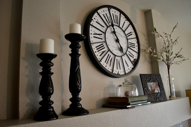
Mix up your mantle. Build up to your focal piece to make the eye move around the arrangement.
 
If you have a lot of family photos or items, keep it from getting cluttered by having the frames and colors simple and all similar. You want to create unity.
To add fantastic color and height to an item, stack funky old books under it.
 
Add a hint of metallic or shimmer to jazz it up. If you like things to look natural and not glitzy add natural glitz like sea glass or mother of pearl like the binoculars below.
 
Now get out all your goodies and showcase what you already have!
More pictures to come soon!


Pin It
Related Posts Plugin for WordPress, Blogger...